Monday, October 7, 2013
Saturday, May 25, 2013
Tuesday, May 14, 2013
Saturday, March 23, 2013
Story portfolio
Wednesday, February 6, 2013
Cannon
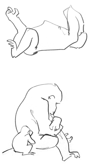
Different stages of some visual development I did for Natalie Ni Chléirígh's graduation film where (spoiler alert?) woodland animals cobble together a deadly cannon from a crashed rocket ship, with a squirrel in charge of the trigger - hence the "squirrel throne" in one of the drawings, a detail I'm forever disappointed won't be making it into the final film.
Friday, January 25, 2013
"Looks more like Brad Storch"
Today at Digital Biscuit (a great new film and technology event organised by the Screen Director Guild of Ireland) I picked up the DVD of the past year's Irish Film Board-funded short films, which includes Pet Hate, the film I worked on in 2011. As a packaging nerd, it is awesome to see my first "proper" film housed in such a nicely put together set.
Anyway, I'm doing a Bart Simpson and pointing out my name in the credits. It's my first screen credit, so I'm allowed. In exchange for indulging me, here's some UNSEEN! concept art from the film (click to embiggen):
Tuesday, December 4, 2012
THE HOUR character colours #2: Marnie
Previous posts:
In this same episode, Marnie (Oona Castilla Chaplin), the neglected wife of Hector Madden, also has a colour palette specific to her. Marnie's main colours are pastel pinks and purples. (Unfortunately, these delicate colours become muddied on film, resulting in a somewhat desaturated swatch.)
Monday, December 3, 2012
THE HOUR character colours #1: Hector
While I was writing the post about the colour palette of the
opening scene from The Hour season premiere (here), I noticed the colour red, otherwise absent from the scene,
showed up whenever Hector Madden (Dominic West) was around. Studying the rest
of the episode, this kind of colour-coding seems to happen with at least two
more characters. But first, Hector:
Sunday, November 25, 2012
PET HATE character design "Little Girl" early sketches
All of the initial sketches done to get some idea of where to go with the design for the little girl in Pet Hate. If I recall correctly, the director asked something that combined qualities from 7 and 8. (Three of these are based on real people, but you'll have to guess which.)
Tuesday, November 20, 2012
Palette study: THE HOUR S02E01 Opening scene
I really like Jordie Bellaire's palette studies on her Tumblr, and suddenly had to do one of my own after watching The Hour the other day, a TV show that pays more attention to the art direction than the script.
In this post I'm concentrating on the opening scene of Episode 1, Series 2, which sticks to the following palette:
Sunday, November 18, 2012
PET HATE character design "Tortoise"
This guy was not a main character, so I don't know why there was this much work done on him. Free fun fact: although he is clearly a tortoise (and when doing these I had in mind a tortoise I happen to know personally) my original files say "Turtle" in the corner.
Wednesday, November 14, 2012
PET HATE character design "Little Girl"
There were more early sketches like the ones on the upper left, I might post them another time. Again, these are all from over a year ago.
Sunday, November 11, 2012
Saturday, November 10, 2012
PET HATE set design/lighting study
I did some work over a year ago on a CG short called Pet Hate, directed by Andy Clarke. Blog's been a bit neglected lately, so up it goes...
The director had very specific ideas about how the film would be lit—the script mentions "a shaft of light" in the dimly lit shop that "shows up the dust"—so this set design doubled as a lighting study.
Saturday, September 15, 2012
Tuesday, April 10, 2012
Friday, March 23, 2012
Friday, March 16, 2012
Monday, March 12, 2012
Friday, March 9, 2012
Brenda Chapman Storyboard Assignment
So a few weeks ago we had classes with Brenda Chapman, which was pretty awesome, but even more awesome was doing the storyboard assignment she gave us and having her look at it, make notes and suggestions and even scribble over some of it.
From the assignment:
"Please storyboard a scene using the 11 lines of dialogue you have been given. The character names are purposefully ambiguous so that you may choose the sex of your characters… or not.
Other than the dialogue, there are no limitations. You are your own director."
I ended up doing something along the lines of "Top Gun with wizards". Storyboard (revised according to Brenda's notes) after the jump:
Thursday, March 8, 2012
Wednesday, January 25, 2012
June 2011
I did Star Trek fan art on the walls of an old FÁS building for the Cork Midsummer Arts Festival last year. I do stuff like this from time to time and just realised I've never blogged any of it. More some other time.
(Installation pieces by Gillian Fitzpatrick, photos by Lou Walker.)
Subscribe to:
Posts (Atom)


